
Tite Kubo

Author Illustrator
Tome
From the editors, by Tome Updated on 20/01/2026

Composition first, explanation later: Tite Kubo draws like a designer who happens to be telling a story.

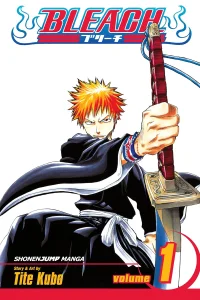
Bleach is built on silhouette and negative space. Kubo gives characters an instantly readable shape, then lets fights play out across empty white panels that make each strike feel isolated and loud. The plot moves through afterlife bureaucracies and warring factions, but the appeal is largely visual.

Background and Influences

Fashion and graphic design inform his work as much as manga does, visible in costume choices that would look deliberate on a runway. He writes character poetry and chapter epigraphs, a habit that gives the series a distinct mood before a single sword is drawn. Western music and film titles surface throughout, used for rhythm rather than for reference.

Style and Themes

His panels are unusually sparse for the genre, trading background detail for impact. Recurring themes are duty, the arbitrariness of institutions, and characters defined by the promise they refuse to break. Villains tend to be given elegance rather than sympathy, and the story is more interested in how a character stands than in what they want.

Legacy and Influence

His approach to page composition is widely studied by other artists, and the character designs remain among the most recognisable in the medium. The series stands as one of the defining serialised titles of its era, and its visual signature outlived the run itself.

Who Should Explore Their Work

For readers who value art direction and want fights that look like posters. Suited to anyone drawn to cool over warmth, and to readers who enjoy large casts of stylish antagonists. Less suited to readers who need every plot thread resolved.

Best manga ranking by Tite Kubo

1
Compete in the Heroes' Tournament and win Amazon gift cards! Discover